As a marketing professional, I respect good design when I see it and I know the impact bad design can have on the outcomes we achieve. At the end of the day, creativity is nice and technology can be amazingly cool, but what I care about is ROI… and that is what I expect design to deliver. The form and function must come together to generate a return for our investors.
Let’s look at one example of a really, really bad design effort and the impact it had on campaign results as a lesson in why and how to design great landing pages for your Inbound Marketing campaigns. In the 2000 United States presidential election between George W. Bush and Al Gore, the Florida vote was ultimately found in favor of George W. Bush… by a margin of just 537 votes out of almost 6 million cast. One can argue ballot design was the deciding factor.
The U.S. Supreme Court in its final ruling on Bush v. Gore, blocked a recount that had been proposed by an all-Democratic Florida Supreme Court. The outcome resulted in Bush having a majority of Electoral College votes, thereby winning the presidential election.
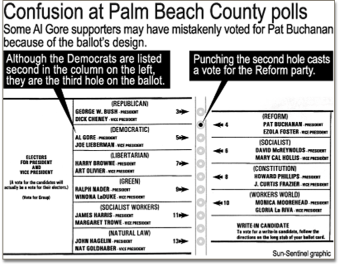
Beyond the problem of “Hanging Chads” we likely all remember, presidential ballots in Palm Beach County offer an excellent example of the impact poor design can have…Look at the Presidential Election Ballot for Palm Beach, FL for 2000:

It is clear to see the selection of Democrat Al Gore and Reform Party candidate Pat Buchannan is very confusing, conferring a distinct advantage to President Bush.
Did the election reflect the true intent of the voters? It doesn’t appear so. There was a disproportionate number of votes cast for Pat Buchanan. Consider this…Gore was the second choice on the ballot, though punching the second hole on the ballot was a vote for Pat Buchanan. He received over 3,000 votes in Palm Beach County — well out of proportion to the votes he received in the other Florida counties. The demographics of Palm Beach voters skews Democrat over Republican, and the majority voting block of elderly Jewish voters likely wouldn’t vote for Mr. Buchanan, whose views opposed their own interests. Yet, Palm Beach County delivered 25 percent of Buchanan’s votes in Florida.
Here’s the thing…If the ballot were laid out differently, we would likely have had Al Gore as President. Regardless of your party affiliation, it is an interesting case study on the impact of design on human behavior.
Now, what if you thought about your Website's landing pages as if they were ballots?
Landing Pages
When you visit many B2B Websites, they don’t even have landing pages protecting their thought leadership content. Intellectual property is free for the taking and there is only one path to provide contact info or request information. Take note as you visit Websites over the next couple of days. You will see what I mean. These sites “waste” nearly every visitor and miss the opportunity to convert a site visitor into a sales lead – all for the want of landing pages (and an Inbound Marketing strategy).
B2B online marketing should include heavy use of offers with unique landing pages as the destination. Given the Forida example, it’s pretty easy to imagine the impact landing pages can on your ROI if you onsider we can possible increase conversion rates on campaigns from say, three to five percent, just by improving their design. Depending on your unit of sale, it could be enormous.
Landing pages have just one objective: To persuade a website visitor to perform a specific action…the Call-to-Action (CTA). To submit a form. We are asking a person to make a decision, right? We want a “next step.” The desired behavior is to visit us and consume content. Why point campaign traffic that we have spent our marketing budget on to a page where there are other options to distract visitors from their original intent to respond to our offer?
In general, make landing pages brief, not confusing. The landing page lead capture fields must be able to give you a snapshot of who the prospect is, where they can be reached, what function they perform in the buying decision process, when they are most likely to buy and how you can reach them, along with a clear Privacy Policy link. Many marketers are satisfied with just basic contact info to reduce friction for responders.
Here are some of the key considerations for improving your landing pages:
Graphics and UX Design -Your landing page has only one goal…To get your visitors’ vote! You want to persuade them to take a specific action, such as subscribe to an email list, fill out a form to download an eBook, order a product, or some other offer. Therefore, site visitors responding to your offer should only have one option before them – the call to action, or CTA. The CTA should tell the visitor exactly what to do, and what to expect in return
Beyond this, the branding, user experience (UX) and visual design of your landing pages should be consistent with your website with one caveat: There should be no navigation options such as home, about, products, or contact us available to the visitor. Links, contact info and other design elements should be removed.
Your Headline - Make it clear, punchy and compelling.
Your Offer - what unique value are you offering your target prospects? Position an offer that appeals to your target audience. Take a 5-second look at your landing page and see if you ‘get the message’ and if you are compelled to take action. (Ex. Let your prospects know that should they get cold-feet and decide to get their money back, that you will offer them a full refund within 30 days—or more for trying out your product or service?)
Image - use engaging images that are relevant to your offer. Great images sell. More people buy because of a visual representation of a product or a service. How your e-book thumbnail is designed is as important as how a book or magazine cover gets people to pick them from the shelf.
Submit Button - Make it pop. Choose the right color, size, location and call-to-action text.
Social Sharing Buttons/Links - Compelling copy should be easy to share to build your following. Sharing buttons must be strategically placed so it does not distract your readers.
Thank you page - optimize your thank you page by providing immediate access to promised resources and offering other direct calls-to-action: Free Trial sign-up, Connect with your social media channels, etc
Short vs. Long Landing Pages: Which is better?
Does the length of a landing page also impact how well visitors convert? Which is better to increase conversions, a short and concise landing page or a lengthier but resource rich landing page?
The answer to these questions is…It depends. Long and short landing pages both have pros and cons. The key questions are who is your audience and what do you want to achieve, given your resources? As a marketer, your buyer personas matter a lot more than you think. You have to craft the best landing page to suit the purpose.
To make a simple analogy, think of yourself as someone who has gone fishing. While the primary objective is to catch fish, you determine the method and the timeframe to bring home the catch. Here are some points to help guide your design:
Long landing pages = The Fish and The Hook
- Long and informative copy is suitable for an audience whose pain you have already identified.
- Your solution addresses a specific need
- One chance to get the fish
- Direct call-to-action (ie. Buy Now)
Short landing pages = The Fish and The Net
- Short and sweet copy that helps a wider audience gain more expert in-depth information (via downloadable e-books, white papers, etc.), promoting your expertise
- Your solution addresses two or more needs or pain points unique to your target
- Longer waiting time to capture, sift and make the sale
- Subtler calls-to-action (ex. Download, Sign-Up for Free Trial, Get Free Consultation)
A/B Testing
Now that you have studied your landing page and marked areas for improvement, start experimenting on which version improves your visitor-to-lead conversions. The rule of thumb is always to see which one is able to bring the best result and then continue enhancing. Oftentimes, a little tweak in color, style, image, positioning can make a lot of difference in the performance of your landing pages.
Landing Pages in the Larger Context of Inbound Marketing
Lead-nurturing process – So you have successfully captured information, then what? Understand timing and targeting. A prospect that is not ready to buy right away may decide to buy in the near future. Make your regular messaging intentional based on their last buying stage (ex. Would they be interested in a trial or additional information, etc.) and send them to new landing pages.
Landing page analytics - Track and monitor your page views, submission rate, number of new leads and contacts, number of shares. Why do you need this? Monitoring the activities and results from your landing page optimization efforts will give you insights on how your audience is engaging with you and where they are in the decision-making or buying phase.
Cost per lead - Use your data to determine ROI and translate your new leads pipeline into revenue projections (Ex. Optimizing landing page reduced your cost-per-lead by 40% but increased your pipeline by X amount compared to the same period before you performed landing page optimization)
Just as poorly designed ballots had an impact on the 2000 election, good landing page design can positively impact the results of your Inbound Marketing campaigns and increase your ROI. It is worth investing in learning best practices to maximize your results.
Good luck and happy marketing!
Many thanks to Lorna Bondoc and Ken Lempit for creative and editorial support on this post.
References:
http://www.will-harris.com/wire/html/design_ramifications.html
http://en.wikipedia.org/wiki/Florida_election_recount
http://positionly.com/blog/inbound-marketing/long-vs-short-landing-page


